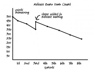
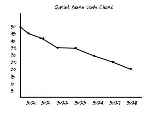
Burndown charts plot units of work that remain to accomplish (y-axis) against units of time (x-axis). In scrum the burndown chart is commonly used to track and forecast progress.
Release Burndown
The units of work that appear on a burndown chart are derived from items in the release or product backlog. During the process of backlog refinement items are assigned an estimated point value that is a measure of effort (also known as “story points” or “size”).
The trend line on a release burndown chart will generally trend downward. However, if new items are added to the release backlog, then the total points remaining may go up.
The release burndown chart is the primary tool a team has for visualizing their “velocity”, which is the average number of points they accomplish during an iteration.
Iteration / Sprint Burndown
The initial point value of work remaining in a sprint burndown chart derives from the backlog items the team commits to during the sprint. Work remaining is generally graphed daily. The number of points the team undertakes is based on their established team velocity, i.e., the number of points they routinely have completed historically.
In scrum, no new work may be added once a sprint has begun, so the trend line will never rise. However, in Extreme Programming, work may be added during a sprint, so the trend line may rise.
Further Learning
Burndown Chart – Agile Alliance glossary


